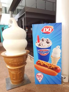
 Dairy Queen (DQ) is a soft serve and fast food restaurant with over 5,700 locations. The restaurant is also available in over 25 countries in the world. Dairy Queen menu prices are slightly higher than the average fast-food restaurant mainly because of their world-famous soft serve ice cream.
There are many different kinds of Dairy Queen restaurants and some do not offer the lunch meals, instead only offering soft-serve ice cream and Blizzards.
Dairy Queen Nutrition
Dairy Queen Happy Hour
Dairy Queen Secret Menu
Below are the latest Dairy Queen menu prices.
Blizzard Treats | Classic Treats | Sundaes | DQ Bakes | Shakes & Malts | MooLatte | Arctic Rush | Soft Drinks | Orange Julius | DQ Combos | Snack Melts | Chicken Strips | $5 Buck Lunch | Salads and Sides | Kids’ Meal
| Food | Size | Price |
|---|---|---|
Blizzard TreatsOreo, Cookie Dough, Reese’s Peanut Butter Cup, Butterfinger, Snickers, Heath, M&M’s, Banana Split, Strawberry Cheesecake, Chocolate Xtreme, Turtle Pecan Cluster, Salted Caramel Truffle, Peanut Butter Cookie Dough Smash, Brownie Cookie Dough, or Brownie Batter |
||
| Blizzard Treat | Mini | $2.89 |
| Blizzard Treat | Small | $3.69 |
| Blizzard Treat | Medium | $4.09 |
| Blizzard Treat | Large | $4.69 |
| Blizzard Treat | Cone | $3.89 |
| Add Extra Stuff | $0.69 | |
Classic Treats |
||
| Peanut Buster Parfait | $4.39 | |
| Banana Split | $4.39 | |
| Cone | Small | $1.99 |
| Cone | Medium | $2.39 |
| Cone | Large | $2.69 |
| Dipped Cone | Small | $2.39 |
| Dipped Cone | Medium | $2.79 |
| Dipped Cone | Large | $3.19 |
| Waffle Cone (Plain) | $3.89 | |
| Waffle Cone (Chocolate Coated) | $3.89 | |
SundaesHot Fudge, Strawberry, Chocolate, Pineapple, Peanut Butter, or Caramel |
||
| Sundae | Small | $2.79 |
| Sundae | Medium | $3.09 |
| Sundae | Large | $3.39 |
DQ BakesHot Desserts à la Mode |
||
| Fudge Stuffed Cookie | $4.19 | |
| Apple Tart | $4.39 | |
| Triple Chocolate Brownie | $4.39 | |
Shakes & MaltsChocolate, Vanilla, Strawberry, Hot Fudge, Caramel, Banana, or Peanut Butter |
||
| Shake | Mini | $2.99 |
| Shake | Small | $3.29 |
| Shake | Medium | $3.89 |
| Shake | Large | $4.59 |
MooLatteMocha, Caramel, Cappuccino, or Vanilla |
||
| MooLatte | Small | $3.49 |
| MooLatte | Medium | $3.99 |
| MooLatte | Large | $4.59 |
Arctic RushCherry, Grape, Lemon Lime, Blue Raspberry, or Strawberry Kiwi |
||
| Arctic Rush | Small | $1.69 |
| Arctic Rush | Medium | $1.99 |
| Arctic Rush | Large | $2.29 |
Soft Drinks |
||
| Soft Drink | Small | $1.79 |
| Soft Drink | Medium | $1.99 |
| Soft Drink | Large | $2.19 |
Orange JuliusStrawberry Banana, Mango Pineapple, Tripleberry, Pina Colada, Orange, or Strawberry |
||
| Premium Fruit Smoothie | Small | $2.99 |
| Premium Fruit Smoothie | Medium | $3.49 |
| Premium Fruit Smoothie | Large | $3.99 |
| Julius Original | Small | $3.19 |
| Julius Original | Medium | $3.39 |
| Julius Original | Large | $3.89 |
| Add a Boost (Protein) | $0.99 | |
| Add a Boost (Fresh Banana) | $0.99 | |
DQ CombosCombos Include Fries & Drink |
||
| 1/4 lb. Bacon Cheese GrillBurger | $3.99 | |
| 1/4 lb. Bacon Cheese GrillBurger – Combo | $6.29 | |
| 1/2 lb. FlameThrower GrillBurger | $5.39 | |
| 1/2 lb. FlameThrower GrillBurger – Combo | $7.59 | |
| 1/4 lb. Mushroom Swiss GrillBurger | $3.99 | |
| 1/4 lb. Mushroom Swiss GrillBurger – Combo | $6.19 | |
| 1/2 lb. Cheese GrillBurger | $4.79 | |
| 1/2 lb. Cheese GrillBurger – Combo | $6.99 | |
| 1/4 lb. Cheese GrillBurger | $3.59 | |
| 1/4 lb. Cheese GrillBurger – Combo | $5.79 | |
| Original Cheeseburger | $2.19 | |
| Original Cheeseburger – Combo | $4.39 | |
| Original Double Cheeseburger | $3.19 | |
| Original Double Cheeseburger – Combo | $5.39 | |
| Chili Cheese Dog | $2.49 | |
| Chili Cheese Dog – Combo | $4.69 | |
| Chicken Sandwich (Grilled or Crispy) | $3.89 | |
| Chicken Sandwich (Grilled or Crispy) – Combo | $6.19 | |
| Chicken Bacon Ranch | $4.89 | |
| Chicken Bacon Ranch – Combo | $6.99 | |
| Chicken Mozzarella | $4.89 | |
| Chicken Mozzarella – Combo | $6.99 | |
| Turkey BLT | $4.89 | |
| Turkey BLT – Combo | $6.99 | |
| Alaskan Pacific Cod Sandwich (Limited Time) | $3.19 | |
| Alaskan Pacific Cod Sandwich – Combo (Limited Time) | $5.39 | |
Snack Melts |
||
| Buffalo Chicken | $1.89 | |
| Chicken Bacon BBQ | $1.89 | |
| Chicken Quesadilla | $1.89 | |
Chicken Strips |
||
| Chicken Strip Basket | 4 Pc. | $5.49 |
| Chicken Strip Basket with Drink | 4 Pc. | $6.49 |
| Chicken Strip Basket | 6 Pc. | $6.89 |
| Chicken Strip Basket with Drink | 6 Pc. | $7.89 |
$5 Buck LunchEvery Day 11-4 |
||
| Deluxe Cheeseburger Lunch | $5.00 | |
| Chicken Strip Lunch | 3 Pc. | $5.00 |
| Crispy Chicken Wraps Lunch | $5.00 | |
| KC BBQ Bacon Cheeseburger Lunch | $5.00 | |
Salads and Sides |
||
| Chicken BLT Salad (Crispy or Grilled) | $6.19 | |
| Chicken Garden Greens Salad (Crispy or Grilled) | $6.19 | |
| Side Salad | $2.19 | |
| Chicken Wrap | $1.89 | |
| Fries | Regular | $2.19 |
| Fries | Large | $2.69 |
| Onion Rings | Regular | $2.49 |
| Onion Rings | Large | $2.69 |
| Breaded Mushrooms | $2.49 | |
| Cheese Curds | Regular | $3.29 |
| Cheese Curds | Large | $5.99 |
Kids’ Meal |
||
| Pick Your Meal, Side, Drink & Treat | $4.29 | |
Dairy Queen was founded in 1940 in Joliet, Illinois by John Fremont McCullough. McCullough originally developed the soft serve formula with his son Bradley in 1938.
Currently, the Dairy Queen brand is owned by the large conglomerate, Berkshire Hathaway.
There are 5 main types of Dairy Queen restaurants:
- Standard – primarily offer DQ frozen treats.
- DQ / Orange Julius – Original DQ restaurant that features foods and drinks from the Orange Julius menu.
- Dairy Queen Brazier – DQ restaurants that serve similar foods to the new Grill & Chill restaurants.
- DQ Grill & Chill – New larger DQ restaurants that serve everything including their frozen treats as well as the new GrillBurger menu.
- Texas Country Foods – DQ restaurants that are similar to the Brazier or Grill & Chill, except they are in Texas and have a custom-branded menu.
Dairy Queen sells many different foods including Blizzards, soft serve ice cream, Smoothies, Shakes & Malts, GrillBurgers, and more. This large variety of food makes the Dairy Queen prices a little higher than the average fast food restaurant. But they have many selections that most fast food restaurants do not, especially when it comes to frozen treats.
For more information about Dairy Queen, visit their official website.
Dairy Queen FAQ

What time does Dairy Queen open?
Dairy Queen opens at 10 a.m. Be sure to check their opening hours based on your location. Unlike other popular fast-food restaurants, Dairy Queen does not open 24/7.
What time does Dairy Queen close?
Dairy Queen closes at 10 p.m. However, in some cities, Dairy Queen closes at 11 p.m. Be sure to check their website or give them a call to verify based on your location.
What year was Dairy Queen founded?
Dairy Queen was founded in 1940. It started as an experiment on a soft-serve dessert and all-you-can-eat for just 10 cents. This turned out well for Dairy Queen, and it has since become one of the most popular fast-food restaurants.
Where was the first Dairy Queen opened?
The first Dairy Queen was opened in Joliet, Illinois. The restaurant was then operated by Sherb Noble, serving the famous soft serve ice cream and other frozen products.
Who owns Dairy Queen?
Dairy Queen is owned by Berkshire Hathaway. They began their ownership in 1998, and it still is a successful business as of today.
How many Dairy Queen restaurants are there?
There are approximately 4,500 Dairy Queen restaurants in the United States, and 6,400 in other locations outside the United States.
Who started Dairy Queen?
Dairy Queen was started by John Fremont McCullough, Alex McCullough, and Sherb Noble.

How did Dairy Queen get its name?
Dairy Queen got its name from John Fremont McCullough who claimed that the cow is the queen of the dairy business. Thus the name came about.
Need prices for ‘cake” b.day party for 15 people
I love dairy queen so much because of their awesome food, and there ice cream.
I just paid 3.75 (including sales tax) for a SMALL dipped cone at Dairy Queen on North Rock Road, wichita, ks
Never ever go back for any item!
Dairy Queen is good but there a few times I would get there chicken strip basket and gravy would look like it had water in it but other then that it was good
I just paid 10.95 for a large blizzard and a chili dog
wow med is 6.59 in Canada large is close to 8$ what a rip off
for a blizzard that is’
We paid over $10 for each large blizzard and they charged an extra $.65 for adding peanut butter sauce even though of course, the sauce displaces the blizzard it goes into. This happened 3/2023 in Green Valley, AZ. We thought the cashier was kidding when they told us the charge at the window.
I just paid over 13 dollars for 2 small blizzards. Never again thats just rip off.
I paid over $20 for 2 mini and 2 small blizzards….far cry from the prices stated. Good thing I don’t “crave” a blizzard very often! $4.39 for a mini blizzard – I should have just ignored my craving.
I just paid over $12 for a small and a medium blizzard in Eatonton, GA. Too expensive, not near the prices shown here. May never go back!
I would recommended two cakes because of the amount of people.
I don’t even see the cake on this menu
no Karen but thank you.
Until the late ’70s, I went to DQ between 3 to 6 times a week. Their ice cream was so creamy. Then they changed their formula. That changed how often I went to maybe once a week at best. Now I don’t go at all because their prices are to high. I can go to a restaurant & eat cheaper & get more food. Their choice.
I got a double cheeseburger plain, small fry and a small blizzard it cost $13.05..that is totally ridiculous, its like $4 overpriced will never go back..they have nothing but dumbass kids working that dont know how to use the cash register..
I’m in Az. Just today I got a Peanut Buster Parfait and a medium shake. The price? $12.19! My jaw dropped when I heard that.
And this was one of those ice cream treats only place. I can easily see them going out of business.
There Food is the best, i would not call it fast food ! Love that stuff!
Blizzards Rock, Burgers melt in your Mouth.
Uhh large shake in Tennessee is only $3.83 after tax….
Why do Dairy Queens never remodel their stores?
Love the food,reminds me of my childhood,
The stores are outdated,look dirty,inefficient counters and never enough staff.Restrooms are the worst!
I am in the Houston, Tx.area and would love to see Dairy Queen put some money back into the old existing restaurants.
Thank you for listening.
well here in Wisconsin st. Croix falls the dq is amazing and so not like that
Love the DQ! chili cheese dog my favorite. Great place to take the kids and lots to select from. They also carry bags of rejects (Ice cream varities I guees somebody made wrong and they package for resale at a good price, but you never know what’s in the bag) is it on the menu? I did not see it.
I like everything on the menu except the prices. Please make more affordable and modernize your store.
Agree with you there, Prices were always too high!
There Stores are becoming bit unkept and dirty.
good food but yes high prices. we got one 1/4 lb bacon cheese grillburger, 1/4 lb cheese grillburger, one large fry, one box of dilly bars, $23.91. no itemized receipt. seems a high price for what we got.
What is the price of a blizzard in a cone???
Who would ever think that DQ has the best tacos?? Love them.
ive used this to play fast food with my friends it is really fun thanks tifbnmcjfodnci
I really like this place, ‘cept it’s super cold inside. Their Blizzards keep me coming back, plus nice cashiers and a non-dangerous miasma.
Would be so nice if fast food restaurants in general stocked serious food for vegetarians. I’m so tired of stopping in and nothing substantial in the way of protein so I have to eat French Fries. I hate French Fries. Would be so nice to have a non-meat burger or non-chicken patties. Get the message, DQ? We are out here, all ready to over-run the first fast food restaurant that has fast vegetarian food that tastes good and is substantial.
Or you could just eat meat like a normal person.
XD that’s hilarious
girl /boy leave him/her alone she/he just be wanting a nice vegetarian option least she/he be out here not eating animals like u
Exactly!
Son I’m disappointed in you. I don’t know what happened after you went to that hippie college, but it must have been terrible to turn you into a vegetarian. Your mother and I love you. Please stop being weird and eat a cheeseburger.
Why would vegetarians pay for food when there is so much free grass outside?
haha amazing, your great
I LIKE YOUR FOOD
Do u know where the cake is?
I luv u so mush
i would like to find out how and where does dairy queen get thier prices. such as making transporting, commercialing, and distribution.
Pray to Soft Serve God and obey economic commandments.
These prices can’t be right for Washington State. It says the flamethrower burger combo is $8.76 which is like $9.60 after tax when i just got that combo yesterday in Spanaway for $7.65 after tax. That’s like a 2 dollar difference O.o
Same in Wisconsin a small vanilla cone is $2.79 each INSANE!
And, that was in Hortonville, WI. I guess the franchise is not regulating pricing.
I like the food but where’s the cake menu
What is the best ice cream there?
The dipped cones. Awesome.
I think that dairy queen is good but there prices are a little high
bring down your blizzard prices please and ill be your friend
I heard a lot of good things about dairy queen. I’m interested to see what happens. There is a building in Glenville that just shut down it was the Aubuchon Hardware store. It is right near near Hannaford I know for a fact some people like variety like me. A lot of people can walk, ride bikes or drive there. I suggest to maybe low the price of the 4p chicken strips because most of us asume they are very small & consider I rip off. I haven’t been there & I’m looking for a especially close to my house. Your decent competition is Applebees, Panera Bread and Target cafe & Starbucks in it & Starbucks in the Price Chopper, Pizza Hut and subway neon sushi it’s not really good it was better as friendlys. We definitely need more restaurants in our area.
I looking for a job
It is a decent building but I don’t know if you might need to fix it up
the prices listed seem too high to be an average for my state. they are more than double what we pay in our city. that seems off.
Hi Karen,
What state are you located in? Thanks!
I bought a 1/4 lb. Bacon Cheese GrillBurger – Combo today(2/9/2016) in Muscatine Ia.It does seem some of the other prices you list are also a bit high.BTW that combo was $6.20 including tax…you had $6.42 NOT including tax.
I did d.q. in Alaska for almost 20 years now they are walking distance going to check them out!! hope I am satisified!!
You need to up date this with dairy Queen prices they are not right in some dairy queens I live in Pevely Mo and it don’t match with them at all it
How much are the children n dumplings
Interesting. I just got home from my nearest DQ in Ohio. Hadn’t had a Blizzard in ages but I felt like having one. They charged me $4.69 for a MEDIUM. That’s the price listed for a LARGE. And it definitely isn’t large. I thought they overcharged me last time I went there, too, about a year ago. Well, I definitely won’t go back there again!
Current manager at a DQ in Indiana here. It’s important to know that most Dairy Queen stores are independently owned and prices will vary depending on the owners. Just wanted to let y’all know! 🙂
DAIRY QUEEN IS SOOO EXPENSIVE PLEASE LOWER YOUR PRICES
I GREW UP LOVING DAIRY QUEEN… I AM NOT CLOSE TO ONE I DON’T THINK..
I CURRENTLY RESIDE AT COLUMBUS COLONY ELDERLY CARE… I AM CURIOUS IF DUE TO COVID-19, IF YOU ARE OPEN FOR DELIVERY AND WHICH LOCATIONS OFFER THIS SERVICE..
I LOOK FORWARD TO HEARING FROM YOU ALL IN THE NEAR FUTURE..
THANK YOU..
Do you have sugar free ice cream, smoothies, milk shakes etc?
What is the price of a dilly bar
$1.49
just went to same one I alwys go to used to get 3 piece chick strip w/drink and ice cream for $5 and 5 piece for $6 today I got 4pc no drink or ice cream for 7.19 and 6 pc for 8.19 and they dont ask if you want a dipping sauce just give you ranch looking at the menu on this site a 4 pc is 5.49 and 6 pc 6.89 very disappointed was also told they never had a chick strip lunch special that included ice cream sorry but I used to get it all the time sad how business places are taking advantage of their customers
I got charged over 12 dollars for a 6 piece chicken strip basket today at the dq by my house. Rip off an I won’t ever eat there again.
Was charged $4.99 for a small Blizzard at the Dairy Queen in Zephyrhills, FL. Felt this was a high price for a small.
I gave my friend a $5 bill to get herself a medium Blizzard. The posted price on the menu was $4.49 plus tax so I knew $5 would cover it. The clerk, named Makayla, rang the price up as $4.69 plus tax, making it $5.08. I informed her that this was the wrong price and that’s where the weirdness began. She became completely silent and started rolling her eyes. She kept looking over toward the cook. I called out to the cook thinking she was the manager and would intervene but she would not make eye contact with me or respond. It was a losing situation for me. It’s not about the extra cents, it’s about informing them about the mistake and the clerk becoming unbelievably rude. This is a Richeson-owned restaurant located in De Leon, TX. It is notorious for being dirty and its poor service.
I just paid $6.29 for a large strawberry shake, way above the price quoted here. This is in the Seattle area. Are DQ prices all over the place in different cities? The clerk was very rude when I asked her.
lets see the the impact of fast food its a injurious to human health
Five of my family love blizzard, shake and ice cream cone or cup in the past with a good reasonable price BUT now the prices are OUTRAGEOUS AND EXPENSIVE!!!
GREEDY!!!!! Of course we find another fast food with the best prices to compare with your company. If your business is not willing to please all of us, BELIEVE that your business will file a BANKRUPT!!!!!!
Hope to hear a good news to all of us regarding the lowest or reasonable prices!
Sun City West DQ is making out like a one armed bandit!! We ordered the same items 3 different times.
One med Blizzard, one mini. !st time $13.99 , second $13.14, 3rd time $12.62 all incl tax. I can go to
grocery store get two 1.5 qt of Tilamook ice cream and have change left over. GOOD BYE DQ !
Last time I was @ a DQ, was 1974 in WI. Dad took us to DQ for a cone after boating on Shawano Lake. It 40 cents +2 cents tax for 4 cones. No restaurant, walk up only.
Well, that was like 50 yrs ago. they rose the prices since than and they also rose the minimum wages since then. so it pretty much levels its self out. ps i’ve never heard of someone actually being payed less than $9 an hour.
I live in Ohio and I got 4 med. blizzards 2 double cheese burgers and 2 regular fries for $64.00. I will never go there again, hell for that price I could go to a nice restaurant and get 2 steak dinners.
My husband and I got 2 small ice cream cones today (and they are very small cones) and the price came to just under 10.00 with tax. This is the 2nd jump in price in this past year. Think we are going to start finding another place to go.
8 dollars for a milkshake in Olympia, Washington
The DQ in Wooster Ohio has just recently changed ownership from Franchise to Corporate and I would like to make a complaint respectfully to this new Corporate Management . I eat at this new location at least twice a week and the other day I ordered a meal and at the table where I was sitting the people that were sitting there left it real dirty so when the employee brought me my food I kindly ask If she would leave the serving tray because I did not want to put my food on such a dirty table but she said she could not leave it due to a Corporate decision so I talked to the Manger about this and even showed her my dirty table as well as a very dirty Fountain Drink area also and she said that they were too busy to clean my table or the rest of the Restaurant. Her exalt words . It is pretty said when you cannot leave a tray to eat your food off from because of a dirty table that they didn’t take the time to clean ! I will have to rethink if I really want to give them my money anymore or not after such a sad way and ridicules reason that DQ Corporate for not letting me use a food tray even though they use to leave you the tray when they first opened ! PS. Their were No other tables for me to move to during my visit .
Just paid $7.01 for a medium oreo cookie blizzard in Hiawausee GA – less than an hour away in Blue Ridge, a medium oreo cookie blizzard is $5.66 – thought prices were set by the corporate headquarters. Won’t be going to the one in Hiawausee GA again – !